
The Visual Evolution of Borjomi
In the material world, nothing remains constant; everything undergoes a transformation. No shape is ever replicated, not even two identical snowflakes exist in nature. Change is inherent, necessary for existence, and existence is a continuous renewal. While the content may persist, the form is in a perpetual state of flux.
Borjomi is no exception; the visual identity of this life-giving water has experienced a fascinating evolution. Bottles and labels have undergone changes, each era leaving its imprint on the Borjomi bottle. Today, let's delve into this intriguing journey.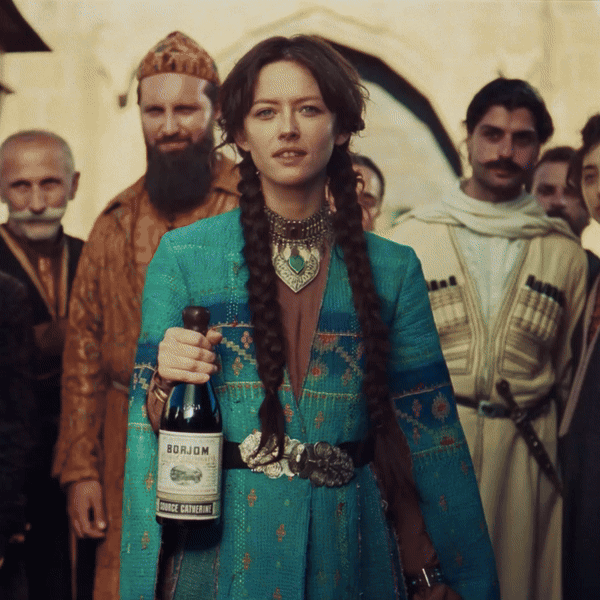
The original Borjomi bottle marked a unique event – its label was intricately engraved directly on the glass. These bottles hailed from distant Finland, no less. Imagine the logistical challenges and unprofitability of transporting glass bottles from Scandinavia!
This prompted the establishment of a glass factory in Borjomi, replacing the white chicken bottles with darker ones. Engravings persisted, and from a contemporary perspective, they exuded elegance.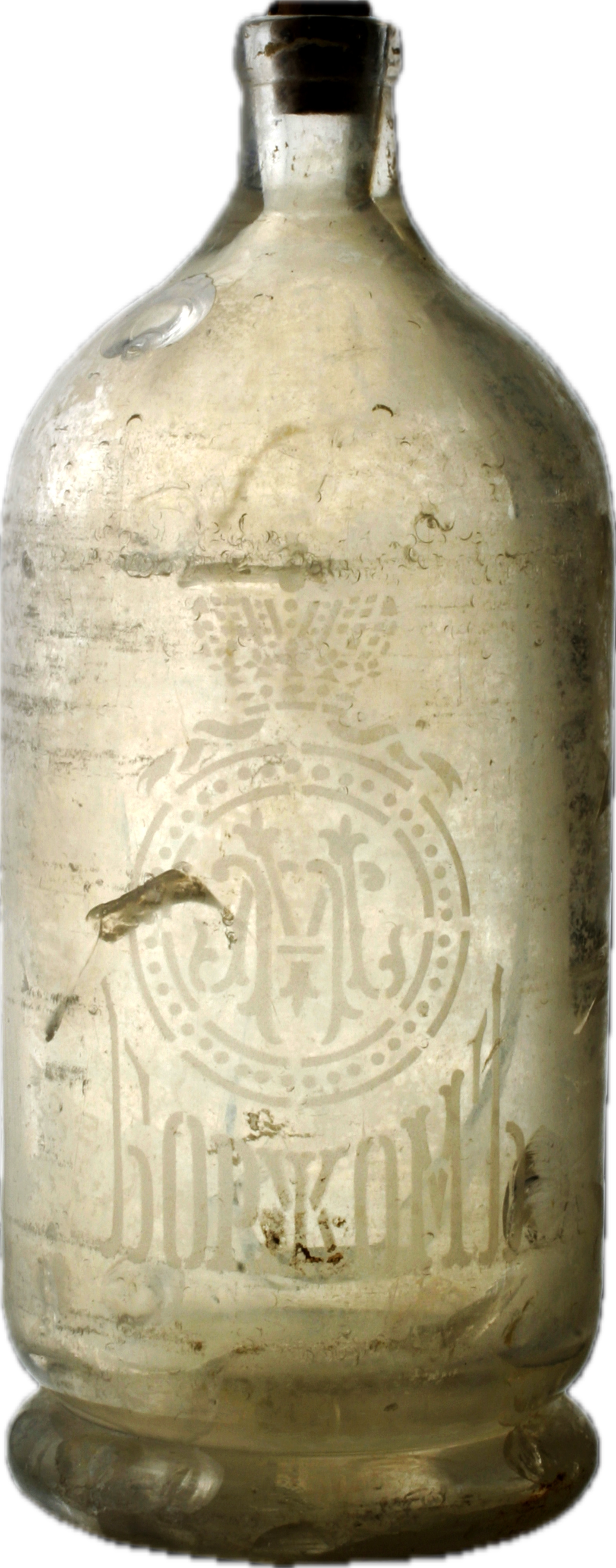
Labels from that era featured inscriptions like "Ekaterina's source" and "Eugene's source." Evgeny Golovin, the ruler of the Caucasus, and Ekaterina, his daughter, were the namesakes. After Catherine's healing, the ruler, impressed by Borjomi's properties, organized springs and named them.
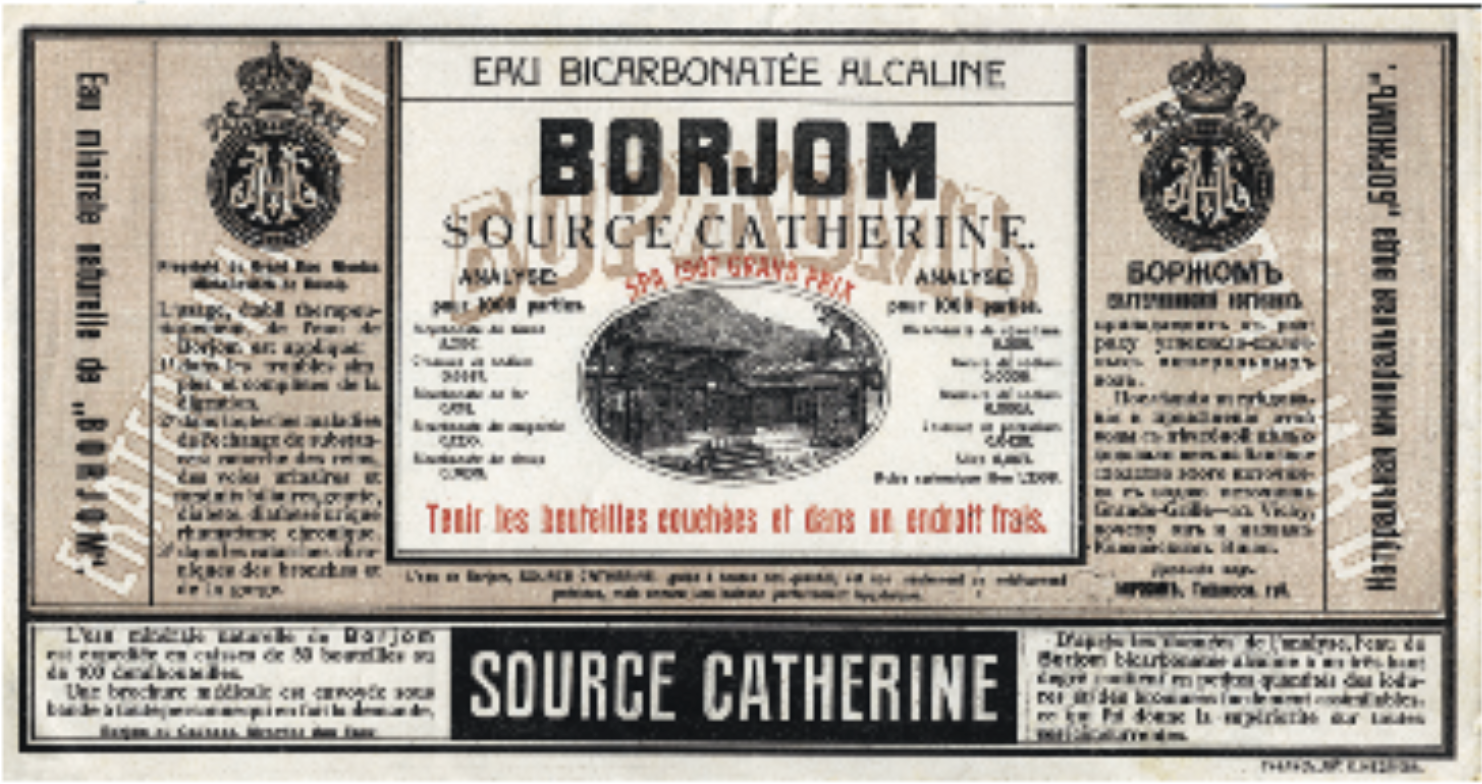
With Borjomi's popularity, the question of export arose. Chemist F. Moldhauser, specially invited, developed a method ensuring that bottled mineral water retained its physical and chemical properties for an extended period. Borjomi transcended imperial borders and entered the foreign market, adorned with fitting labels.
The mineral water quickly gained international recognition, garnering awards in Belgium, Germany, and Russia. Successful exhibition appearances and global acclaim made Borjomi a household name.
From the second half of the 20th century, Borjomi became Georgia's iconic representation. At this point, branding interventions became more delicate, and changes to the Borjomi label were executed with great care.
All bottle versions maintained a combination of red and blue colors, the iconic Borjomi fountain, and an engraved deer.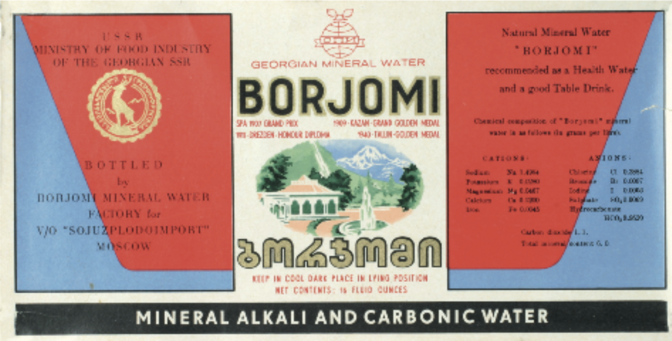
While label strokes underwent slight changes, the enduring blue-green color, dubbed "Georgian green," was retained, creating a visually memorable impression imprinted in people's consciousness.
Despite unclear inscriptions, the Borjomi bottle made appearances in famous films like Solaris, The Terminal, The Bourne Ultimatum, etc.
The collapse of the Soviet Union affected everything, including Borjomi, giving rise to a completely new era for the brand. In 1995, the establishment of the "Georgian Glass & Mineral Water" company took over production, bringing the beloved brand back to the people.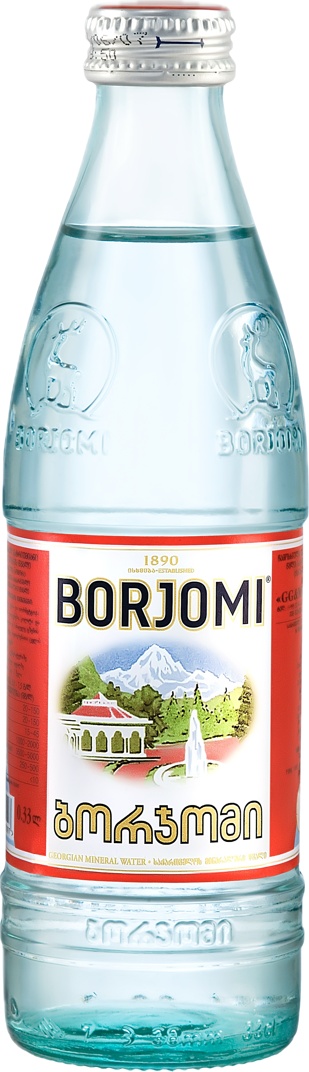
The year 2010 marked a rebranding phase for Borjomi, with changes to the label and bottle shape. As a purveyor of life-expelling harmful substances from the body, Borjomi conveyed the message: "Get rid of excess," resonating globally.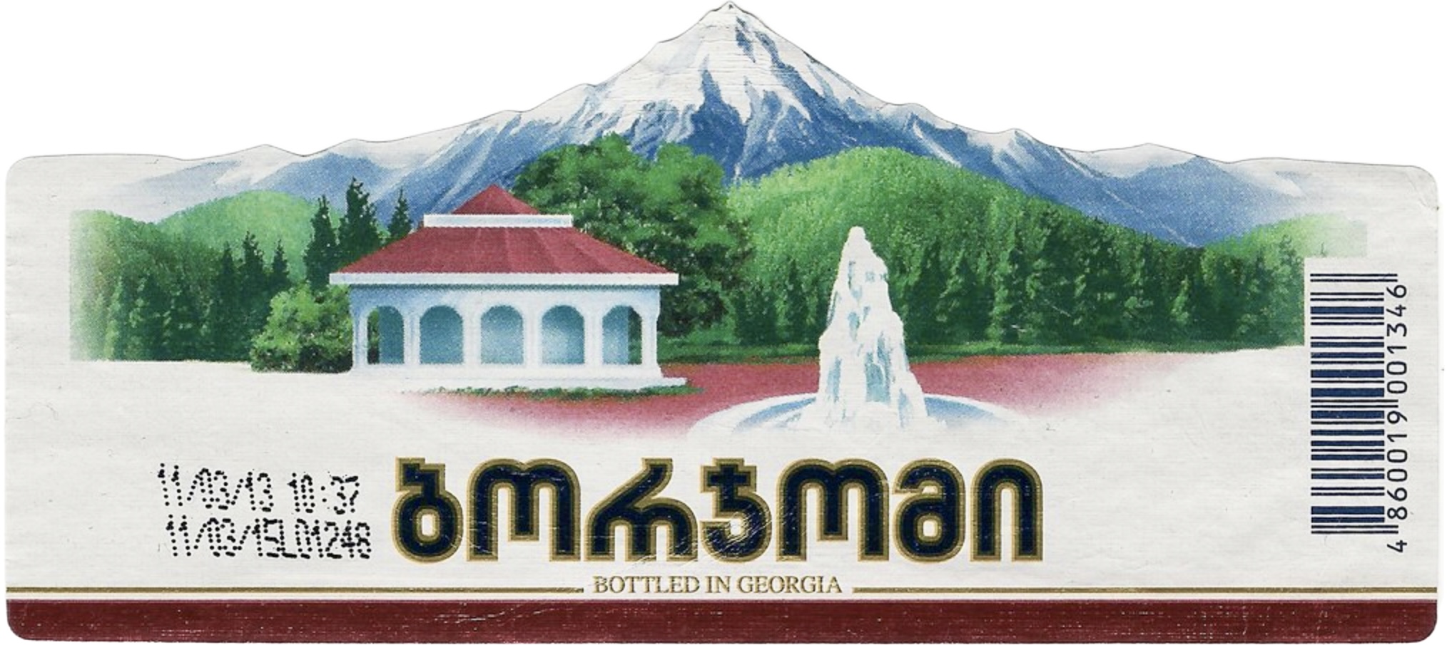
Since 2019, the Borjomi logo has undergone further enhancements, with an updated cap and the introduction of silver accents, emphasizing the brand's premium status. The history of Borjomi can be explored through the QR code on the packaging.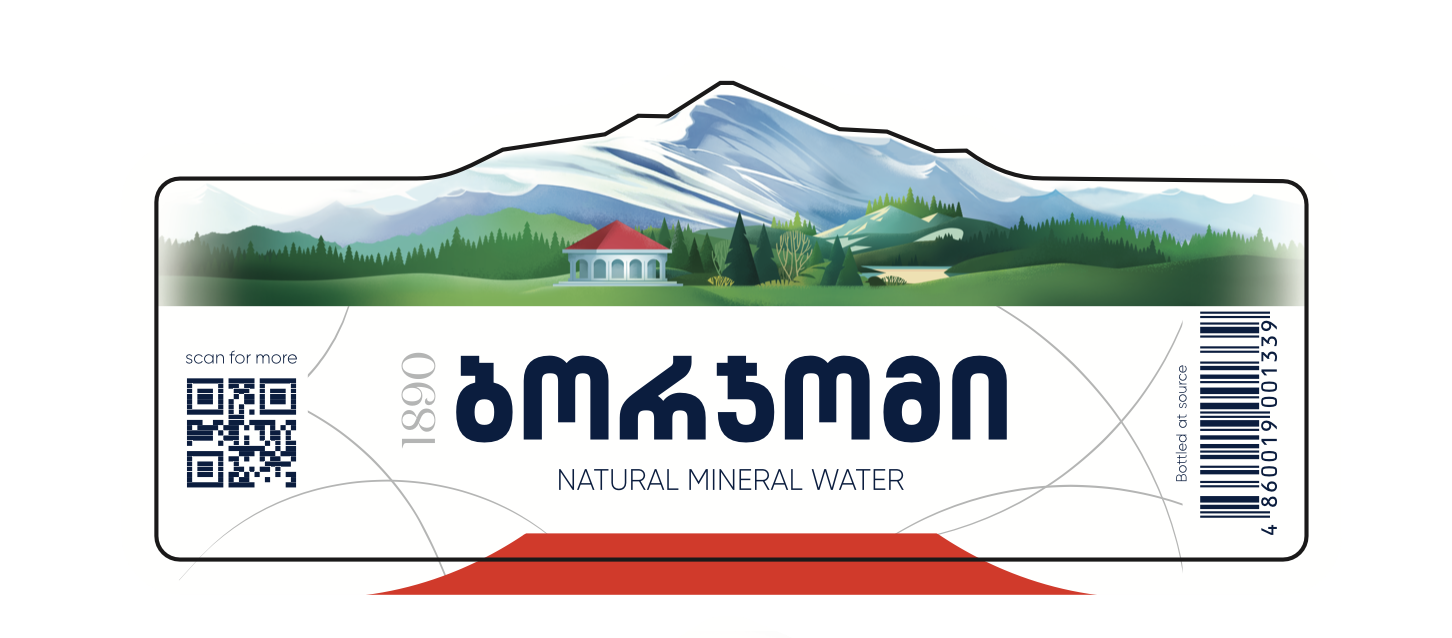
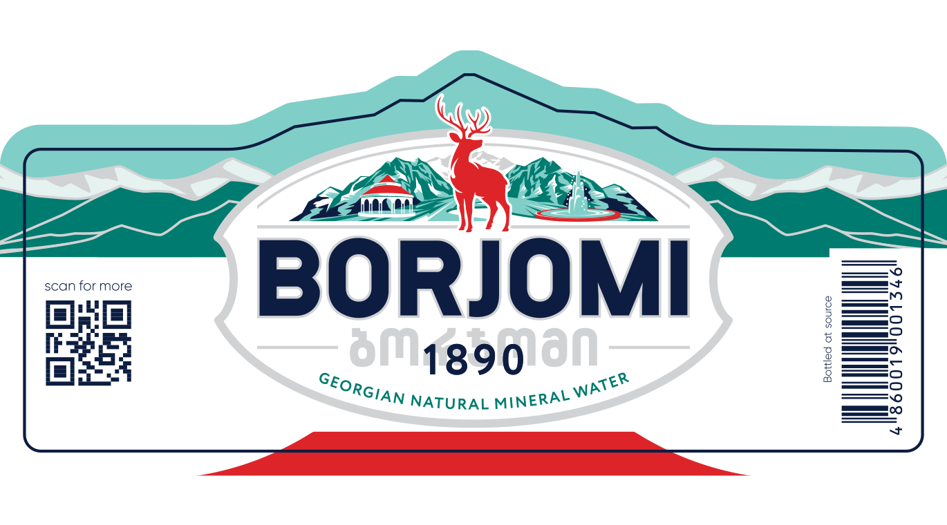
In 2024 Borjomi with new label appeared on the shelves. The new visual identity is inspired by the rich history of the brand. The main symbol of “Borjomi” – a deer is prominently featured on the updated packaging, appearing on both the front of the bottle and the center side of the label.
The key elements that define “Borjomi” over the years, including the mountains of Borjomi, which together with the logotype, the deer and the buvette combined in one modern oval visual image, are even more emphasized.
Additionally, the name is highlighted in both Georgian and English in the central part of the label. The green cap of “Borjomi” remained unchanged. The renewed packaging further emphasizes the premium nature of the brand.
Borjomi continues to evolve, responding to the demands of modern times. The introduction of Borjomi in an aluminum can, especially with the design by David Koma, stands as a testament to this evolution.
Therefore, both the interior and exterior of Borjomi are ever-vibrant and updated. It changes shape, transitioning from bottle to bottle, from jar to jar, but the essence remains constant – Juvenal water, brimming with life, a bouquet of minerals from the depths of the earth.
Enjoy it!